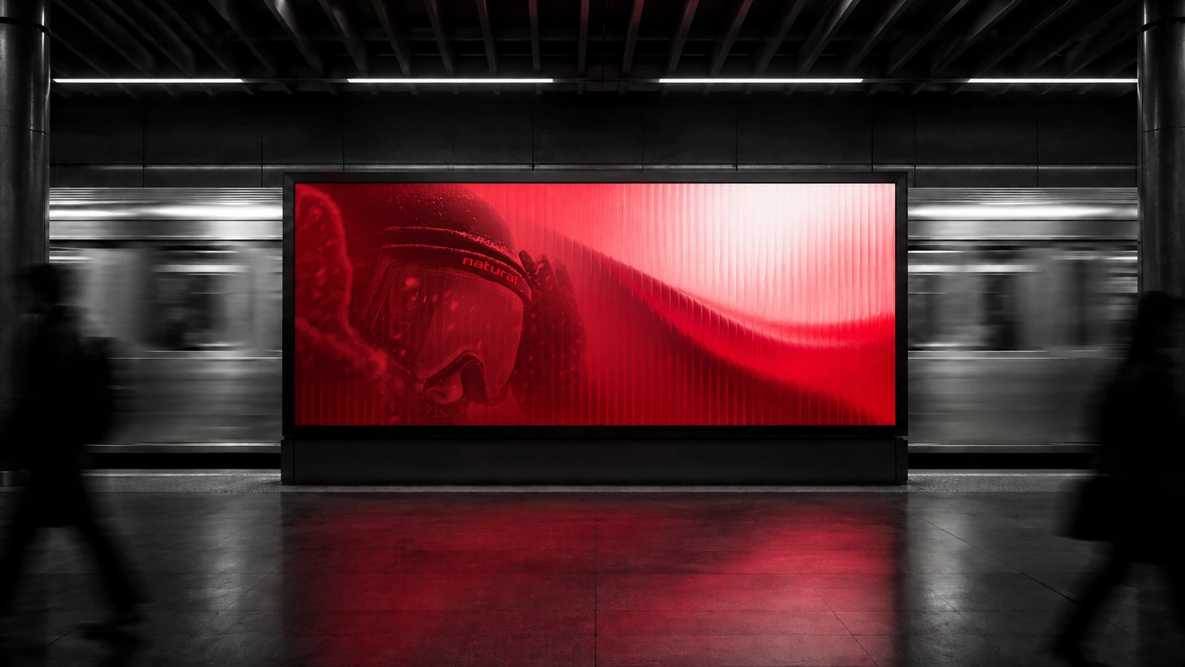
Designing a billboard for a moving audience
On a station platform, the audience sets the pace. Distance, motion, and a passing glance shape what the design has time to say.
A layout looks different once it leaves the artboard. The platform has its own light, the train breaks up the view, and someone heading for the stairs may only see a corner. Those conditions belong in the brief from the start.
Design for three distances
A commuter can catch the same billboard three ways. Across the platform it’s a patch of red. Through a train window it’s a glimpse of a face. Up close there’s time to read the name. Decide what someone should take away at each distance.
Work with the platform
Start with a photograph of the placement and build the artwork inside it. In a dark station, a bright field of red can draw the eye on its own. Keep the mark clear of a column or a passing shoulder, and give the eye one place to land before introducing smaller details.
Test a passing glance
To test the layout, put it on a phone, hold it at arm’s length and glance at it as you walk past. Ask someone what they remember. If the color comes through but the name disappears, adjust the scale or position of the mark and try the same test again.