Designing an icon for small screens
An icon looks different beside a calendar, a camera, and a row of other apps. That is where to judge its scale, contrast, and finish.
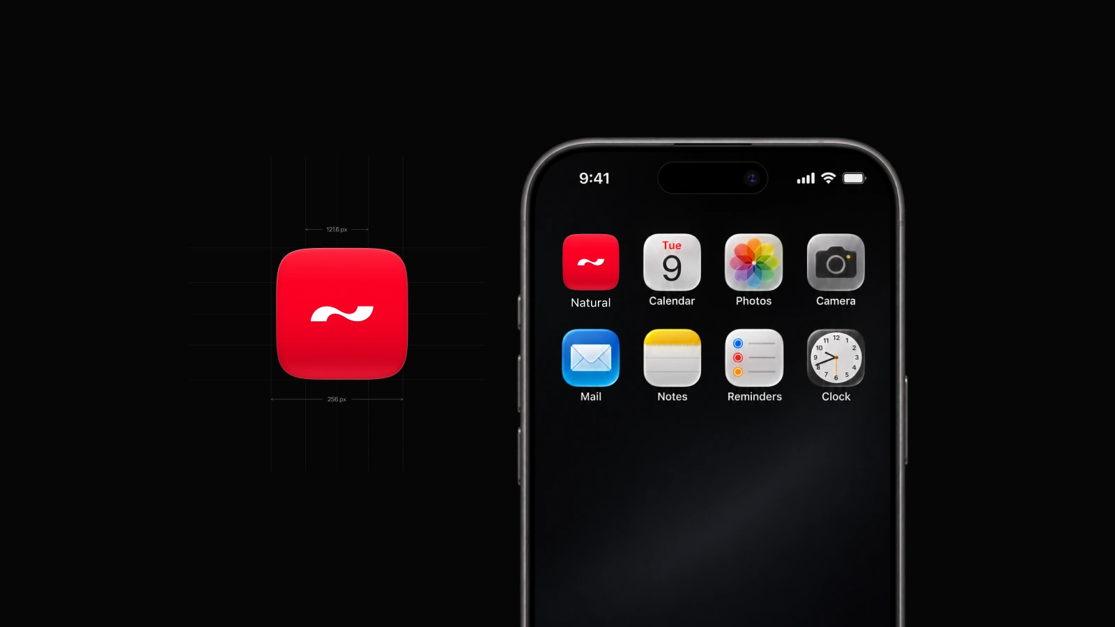
In the enlarged drawing, you can see the curve of the white mark and the shift in red toward the lower edge. On the phone beside it, the icon is about the size of a fingernail. The same drawing has to work at both distances.
Start in the grid
Put the icon beside the apps people already recognize. Compare the apparent weight of the white mark with the envelope on Mail or the lens on Camera. A wide horizontal shape can feel crowded even when the artwork has the same measured margin on all four sides.
Give the mark room
On the Natural tile, red shows through both sides of the white curve. Reduce the artwork to its home-screen size and follow that curve with your eye. If the ends disappear or the middle loses its shape, adjust the scale in the master and check the small version again.
Judge the finish on a phone
A little light along the edge gives the tile depth. Turn the phone brightness down and see which detail catches your eye first. The red square and white mark should still read together after the highlight has faded from view.